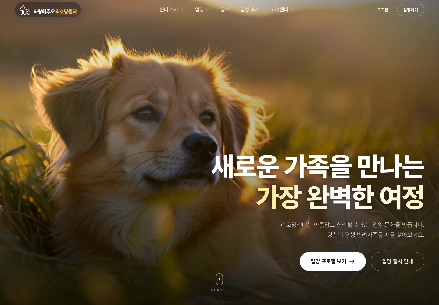
Make the first step
feel approachable.
Exploring adoption is an emotional decision, with practical questions along the way. The website needs an inviting first impression and an understandable path into the information.
I developed Rehoming Center with a focus on its UI and UX: the visual atmosphere, the hierarchy of the page, and the routes into pet profiles and adoption guidance.
Feeling and function,
in the same experience.
The interface gives each part of the journey a role.
Let the image speak.
A large photograph and a clear headline give the opening a warm, distinct presence.
Give the next step weight.
Adoption profiles and process information have direct routes from the homepage.
Make room for the details.
Profiles, guidance, and common questions support a closer look after the first impression.
From the first impression
to the next step.
My work connects the visual design to the implemented experience: a distinctive homepage, clear routes into adoption information, and pet profiles that visitors can explore in more detail.
The profile listing includes category and adoption-status filters. Together with practical guidance, those pages give visitors a way to move from an initial interest to the details they need.
Explore the adoption profiles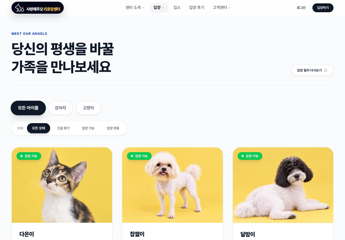
Something worth
building?
Tell me what you want to build,
automate, or understand better.